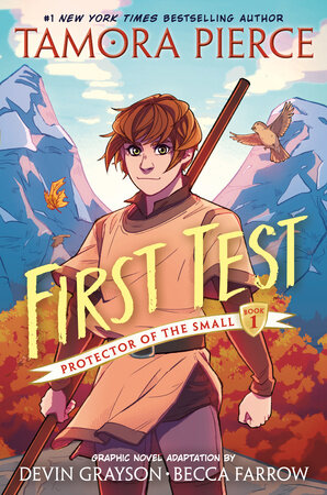
Tamora Pierce is near and dear to my heart. A piece of my childhood, and one I try to get as many kids into as possible throughout my teaching career. She’s that good. First Test is probably the series I know best, and I think it’s Pierce’s best work. This graphic novel adaptation has been sitting in my classroom for a while, and I finally got a spare half our to read it.
Good news: I had a great time! It was like getting a shot of nostalgia straight into my bloodstream. I got the experience of rereading a favorite in a single sitting.
Bad News: I don’t think it’s actually that good of an adaptation, and certainly isn’t going to satisfy someone who doesn’t already know the story.
Anyways, this review will only partially be a review. The other half will by my assorted thoughts on what makes a good adaptation. I think I’m generally in the minority on that topic.
On the Subject of Faithfulness
Most often, I hear people laud or ridicule an adaptation for whether or not it is faithful to it’s source material. Do they have the right scenes? Is the timeline the same? Do the characters feel true to the book? Do the themes remain the same? HAS THE LORE BEEN CHANGED EVEN ONE SMALL BIT?
It’s not that I don’t care about faithfulness. I think an adaptation should be recognizably connected to it’s source material, and it certainly shouldn’t change everything. However, I’m happy for big chunks of a product to change, including if it shifts the core ideas of the story. The Lord of the Rings movies, for example, indulge spectacle in a way the book does not. In fact, they have more stylistically in common with 90s fantasy than anything Tolkien wrote, other than the names and basic story. The movies were better for this.
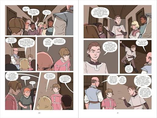
First Test is a remarkably faithful adaptation of book 1. Too much so, in my opinion, but we’ll get to that later. Ever major scene is present, Kel is true to her original portrayal, and I think the aesthetics of the book are about as faithful as you’re going to get in a comic format. I want to give special props for the use of colored backgrounds to help showcase Kel’s internal state, since canonically she’s not a visually expressive person. All the basics were here to transport me back to my reading experiences, letting me immerse myself in a 5 hour read while using only a fraction of the time.
The dialogue is notable and exceptional. Of course, lots of it was lifted word-for-word from the books, so credit mostly goes to Pierce’s writing, which I already know is high quality. Still, they made smart choices about which bits to include, and nothing that I was really looking forward to was missing. My beloved Neil was downright glorious, the sarcastic asshole. This book’s faithfulness made it the platonic ideal for someone like me. First Test is written with prose-readers of First Test in mind. Fantasy fans in their 30s, rejoice! You have been chosen!
Why Changes are Necessary
Unfortunately, the nagging voice in my head kept calling my attention to how much work my prior knowledge was putting in. There were so many scenes where I recognized the things happening, but which weren’t clear in the story. In my opinion, Graphic Novels generally take a higher page count to achieve the same effect as prose, especially if the artist is keeping things straightforward and representative. There are things that visual art achieves much more quickly and effectively of course, but in terms of story progression and character arcs, comics just need more space. This adaptation is 100 pages shorter than the novel, and it doesn’t leave anything out. That means that almost every scene and moment of development gets rushed.
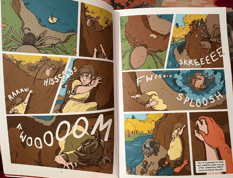
Let’s take this pair of pages from the opening. Kel is being an idiot, saving a kitten from a spider-monster. It’s her moment of choice, deciding to try for Knighthood despite the sexist rules imposed upon her. It’s also the moment we are exposed to her crippling fear of heights, a core part of her identity that comes up relentlessly throughout the first three books. I understand that Kel is scared of heights: that’s the FWOOOM sound effect. Where is the slow zoom out to show how far the ground is from her? Where is the zoom-in on her eyes? Where is the the true visual representation of her panic and paralysis? Her fear is established, but I wouldn’t say that it’s acknowledge or explored. Hell, even a caption would have gone a long ways towards clarity. I think a kid could read this entire book and not realize Kel is terrified of heights.
That’s one small moment, but the story is filled with similar ones. We see Kel feed the sparrows once, then they’re gone until the Spidren hunt. No bonding or care scenes (making people attached to animals is something comics are good at! Lean into this!). Peachblossom is supposedly ornery, but we never see it. Seaver charging at monsters shouting ‘you killed my father’ means nothing because Kel hasn’t had any real conversations with him, so he just seems like a random guy. We see the study group grow, but not as a reflection of Kel’s bravery and leadership. It just gets bigger.
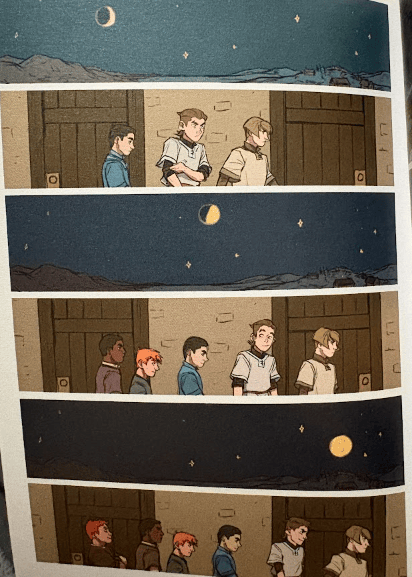
I understood everything with crystal clarity. I saw the depth of the story, the character arcs, and the thoughtful criticism of misogyny that Pierce wrote. However, I know all this because I’d already read the book. This comic requires readers to transpose their own personal history into the adaptation to fill in the blanks. It’s like the story is one huge montage. Great for people who know the source material, but not at all accessible for people who don’t.
In hindsight: it makes sense why my students haven’t been picking this up.
How to Fix It?
I say this like I could do even a fraction as well as Grayson (Adapter) and Farrow (Art) did. I can’t, and nobody would want to read my adaptation. The big sin here is page count. I think there just wasn’t enough space to both include all relevant plot points & iconic scenes while also creating something that is a good comic independent of the source material. 100 extra pages would be a start, but this would shine at triple the size and space for the art to take over more of the thematic heft.
That all is probably a publisher decision. 300-400 page graphic novels aren’t the norm, especially in the kids market.
If we must keep the page count the same, the easiest first step would be captions. If there isn’t enough to let sequential art work its incredible magic, turning back to prose helps you close some of those gaps. At that point, why not just go read the original novel, but at least you have an accessible and emotionally intense product for kids to learn how great Pierce’s stories are.
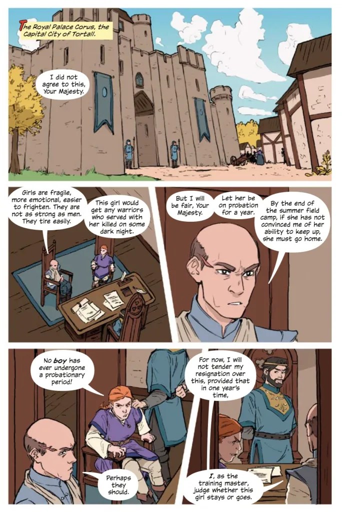
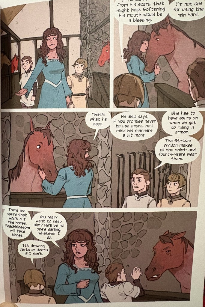
Beyond that, I think more scenes need to get cut. Not every small moment needs to be showcased. Wyldon telling Keledray she should run up the hill? Great and thoughtful, especially since Wyldon needs as much characterization as he can get this early on. But take that out to buy more space in other areas. Cut out the flashback to the Yamani Islands, and for that matter remove all the scenes with Daine and Alanna (protagonists of earlier series in the world). Cameos are fun, but they aren’t needed here, especially since Kel doesn’t actually meet Alanna for a few books. Let her be a mythical figure for now.
That adaptation would be less faithful, but it would have been better. Because it would have leaned into the things that make this book so very special.
Conclusion: great for Pierce fans, but not a good entry point into her writing. For reluctant readers, the audiobooks are SO. DAMN. GOOD. Try them instead.


Adaptions are across mediums. Different mediums are best for different parts of storytelling. When your ‘adaption’ changes nothing – is perfectly faithful – you’re not utilising the new medium; at which point, why bother adapting it at all?
Adapting from prose means, imo, you should lean into the visuals. Your example about Kel’s fear of heights, and tweaks that could have been made to that double-page spread, is a great example.
The LotR films are another excellent example. So much of the visual storytelling in the films is completely absent from the books – the engravings and jewellery and general decoration on the weapons and clothes etc of the Rohirrim enchanted me in the film, and they’re not in the book. There was so much attention to detail in the sets and costumes etc in the film, it made the world feel so REAL. Lived-in. And you can try and do that in prose – I’ve seen it done often and well! – but it packs a different punch when you can SEE it.
I’d also argue that things like, giving Arwen an actual storyline through the films, made for a better story, certainly a better film-story. Or in the Lion Witch and the Wardrobe film (the latest one I mean) we got the battlefield scenes that were only summarised for us in the book. I find changes like that so fascinating, and sometimes they’re terrible, but sometimes they’re excellent and add a lot. And if there are NO changes like that, I’m not sure why you’re bothering with an adaption. If the story doesn’t need changing, why not leave it in its original medium?
Adapting across mediums is like translating, I think. Sometimes a word-for-word translation turns into nonsense, or otherwise kills the author’s original intent. Same with prose to not-prose. What’s the intent of the scene, the story, and how can you express that without prose? How can you recreate the FEELING of it in a different medium? It’s an art. And way too many adaptions don’t seem to get that.
LikeLike